
Spotting trends in your data is such an important part of data analysis. Why? Because seeing the trends in your data helps you to make informed decisions, and the quicker you can make decisions and implement actions, the better, right?
I’m sure it’ll come as no shock that Excel has an ACE feature that will help you spot trends in a flash – and even less of a shock that I’m going to tell you all about it.
Conditional formatting in Excel is a tool I use a lot. It’s one of my absolute favourite tools and I love it because it can really make information jump off the page for you (without the need to read every last detail to get to it).
This tool enables you to visually highlight trends, variances, and outliers within your data, making it easier to interpret and act upon.
This is great if you’re working with people who aren’t used to Excel or reading data in a spreadsheet format as it really brings the information to life and gives them a more easily digestible
In this article, I’ll walk you through how to spot trends using the Conditional Formatting feature, helping you to become a data analysis trendspotter!
Implementing Conditional Formatting in Excel is actually a very straightforward process. I’ve filmed a short tutorial video for you which you can watch below:
Let’s take a look at how you can utilise this tool in your data analysis in just 6 simple steps:
To start, you’re going to highlight the data range you want to analyse. It can be a column, row, or the entire spreadsheet.
Once you’ve highlighted your data range, go to the ‘Home’ tab in Excel. In the ‘Styles’ group, click on ‘Conditional Formatting’.
Here you’ll find a variety of options, such as data bars, colour scales, and icon sets. I always give a warning at this point because it’s easy to get tempted by all of the options.
These are really shortcuts. The problem we have is that when we choose one, it’s applied to your sheet without telling you the rules of the formatting. This can easily lead to inaccurate data readings (which is absolutely not what we want).
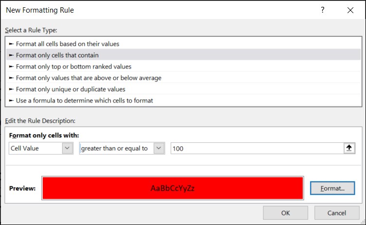
So for now we’re going to go to the bottom of the list and select ‘New Rule’ to create our own formatting.
Once you’ve clicked on ‘New Rule’ a new window will open to build out your rule.
The first thing to do is to choose a rule type from the options in the top half of the window.
As you click on the rules, you’ll notice that the bottom half of the window changes. This bottom half is your rule description and can be edited to make the rule fit your specific parameters.
For example, if you’re tracking expenses and you need to flag a payment that is over £100 for querying, you might choose the ‘Format only cells that contain’ rule and have any cell values over £100 show up in Red.
You might even want to implement a full traffic light system and have values less than £50 show as Green, and values between £51 – £100 in Yellow.
To implement this in this scenario you would input a value range in the rule description and then click the ‘Format’ button to choose a colour for the cell to change to under the ‘Fill’ tab.
Once you’re happy with the rule you’ve created, you can click ‘OK’ to confirm it and apply it to your sheet.
You can include multiple rules in your sheet.
So, if we were going to implement the traffic light system outlined above for our expenses, we would highlight our set of cells and go back into ‘Conditional Formatting’ in the data ribbon.
This time, instead of choosing ‘New Rule’ we’re going to click ‘Manage Rules’ as we already have a rule existing.
This will open the ‘Conditional Formatting Rules Manager’ which will show us all of the rules we have in place on our sheet. From the rules manager, you’ll be able to edit any existing rules, as well as adding new rules to your sheet.
You can now click ‘New Rule’ from within the manager and repeat the process of setting up a rule from Step 3.
When you click ‘OK’ after setting up your new rule, you’ll be taken back to the rule manager where you’ll be able to see how the rules are building up.
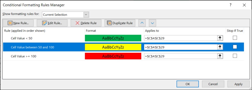
TOP TIP: Within the rule manager you’ll see that it tells you the range that your formatting applies to. If you want to extend or reduce the range you can simply adjust the cell numbers in here for a quick and easy update!
Once you’ve added all of your new rules within the rule manager, click ‘OK’ to switch them all on.
You’ll immediately see them pop into life on your sheet, highlighting all the cells in the selected range that meet the criteria for each of the individual rules you’ve created.
TOP TIP: If you’ve used colours in your conditional formatting, you can also filter your columns by these colours once the rules are applied – isn’t that ACE?!
This next step is completely optional – but I think it’s a fun way to add a bit more character to your sheets.
To add icons, we’re going to go back to those preset rules that I told you to ignore earlier.
Click ‘Conditional Formatting’ in the Home Ribbon and then click on ‘Icon Sets’. Click on the preset icons you’d like to apply.
You’ll now see these added to your sheet. The difference now is that thanks to the rules you’ve already set up yourself, you’ll be able to understand the rules Excel presents for you better and know that they are accurate to the purpose you have in mind.
If you notice that the icons are mismatched to your rules, we now also know how to change and edit a rule!
Go back into ‘Conditional Formatting’ > ‘Manage Rules’ and you’ll see the icon set sits alongside your other rules. Highlight the ‘Icon Set’ rule and select ‘Edit Rule’.
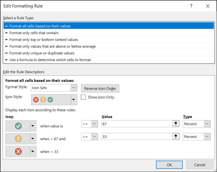
You’ll notice that the rule description looks a little different this time. The solution to changing this is a bit like platform 9 ¾ (it’s hidden in plain sight). ????
In the lower half of the window, you’ll notice there’s a box that says ‘Format Style’. This box allows us to toggle between different styles of formatting (such as ‘2-color scale’ which we’ve used to apply the colours to cells, or ‘Icons’ which we’re using now).
You can change your icon style in the ‘Icon Style’ dropdown underneath the ‘Format Style’ box.
You can now play around with the rule description to make them align with your needs. This includes being able to select whether you want the value to be less than, greater than, or equal to, the value you want to check, as well as the type of value (i.e. number, percent, formula or percentile’).
TOP TIP: When you change the value type, it will reset the value number. So always choose your type before inputting the value.
Once you’ve inputted your first row, you can click the icon in the second and third rows for them to update automatically. Once you’re done, click ‘OK’ to return to the rule manager. Click ‘OK’ again to close the rule manager and to apply your new rules.
You’ll now also be able to filter your sheet by the icons in your Conditional Formatting.
If you need to remove a rule, deleting them is a very easy process.
Head back into ‘Conditional Formatting’ > ‘Manage Rules’, select the rule you want to remove, and then click ‘Delete Rule’ at the top of the window.
Once you’re happy with the set of rules you have in place, click ‘OK’ to apply them and return to your sheet.
By setting specific rules, you can bring your data to life, making it jump off the page and allowing trends and patterns to pop out of your sheet just by looking at them.
This feature is invaluable for large datasets, financial reports, sales figures, and any data-driven scenario where trends need to be identified promptly and accurately.
It will save you SO MUCH time that would otherwise be spent trawling through rows and rows of data to try and manually identify. I don’t know about you, but that would definitely make my eyes blurry!
Here are a couple of the other ways Conditional Formatting can help with your data analysis:
Conditional Formatting can help you identify the highs and lows in your dataset.
For example, you can use a colour gradient to highlight cells with the highest and lowest values.
This quick visual representation allows you to pinpoint outliers effortlessly.
When dealing with time-based data, Conditional Formatting can track progress over different periods.
For instance, you can use a gradient scale to show sales performance over months.
Darker shades could represent higher sales, while lighter shades indicate lower sales, providing a clear trend analysis at a glance.
Conditional Formatting also assists in spotting deviations from the norm.
You can set up rules to highlight cells that deviate significantly from the average or expected values.
This helps in quickly identifying areas that need attention or further investigation.
Comparing data sets becomes a walk in the park with Conditional Formatting.
By applying different formats to data sets and setting up rules, you can visually compare trends side by side.
This is particularly useful when comparing sales figures of different products, the performance of various departments, or responses to surveys over time.
Conditional Formatting is a game-changer for jazzing up your spreadsheets and making it far easier to spot trends and important information in your data.
This not only enhances your data analysis capabilities but also enables you to make strategic decisions with confidence.
So, dive into your data, explore the world of Conditional Formatting, and elevate your data analysis powers to ACE new heights.

