
Project management is a challenging role to take on. It often involves spinning so many plates all at the same time – managing tasks, timelines, budgets, workforce and resources.
As a business owner, project management often becomes part of my role. Organising all the elements that go into a project can be difficult. What I always find helps me most is being able to visualise the project and its timeline.
That’s where Gantt charts in Microsoft Excel come in super handy (and of course, Excel to create them).
In this article, I’m going to show you how to effortlessly create Gantt charts in Microsoft Excel that will help you organise your project and make management a complete breeze.
But first, let’s start by answering two very important questions…
So before we dive into Excel’s Gantt chart capabilities, let’s grasp the fundamentals of what makes a Gantt chart and why it’s so useful.
To put it plainly, a Gantt chart is a type of bar chart that’s used to illustrate a project schedule.
It will typically consist of tasks listed on the vertical axis and a timeline on the horizontal axis. Bars represent tasks, with the length of the bar indicating its duration.
Durations between tasks are illustrated by the positioning of the bars. Longer bars typically denote more extended tasks, and the overall chart provides a clear overview of the project’s progress and timeline.
This is a useful visual tool to have as it will allow you to assess how long a project should take, determine the resources needed, and plan the order in which you’ll complete tasks. It also helps you to see how tasks interlink and overlap with one another.
So how do you create a Gantt chart? Well, Microsoft hasn’t provided us with a tutorial, but don’t worry, I’ve put one together for you below:
First things first, for this simple method you’ll need to set up a sheet and organise your data.
Add column headers for ‘Description’ (name your tasks), ‘Start’ (when your tasks will begin),’Duration’ (how long the tasks will last) and ‘Finish’ (when your tasks will end).
Charts in Excel aren’t very keen on using dates, so for creating your Gantt chart, I recommend using period numbers to fill out the ‘Start’ ‘Duration’ and ‘Finish’ columns.
Input your ‘Start’, and ‘Duration’ periods, then move over to your ‘Finish’ column and use the SUM function to calculate your end date.
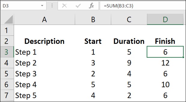
In this example, for Task 1 I have used the formula SUM=(B3,C3) and this has calculated my finish date as period 6 (5 periods after the start date of period 1).
You can now add in the rest of your tasks in the same way.
Now that you have your durations in your sheet you can plug this data into a chart.
Highlight all of your cells and then head to the Insert Ribbon and select ‘Charts’ > ‘Stacked Bar Charts’. I’ve used a 2D stacked bar chart in this example.
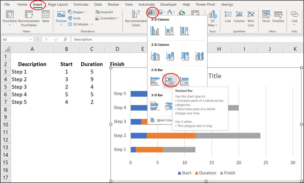
Once you generate your chart, you’ll see that the ‘Start’ ‘Duration’ and ‘Finish’ information appears for each of the tasks you’ve set.
We don’t really need to see the ‘Start’ or ‘Finish’ information in our Gantt chart – we’re just interested in visualising the duration of the tasks in our projects – so, we’re going to remove these.
Left-click on any of the ‘Start’ sections within your chart (this will select them all) then right-click and go to ‘Fill’ in the dropdown menu.
Select ‘No Fill’ and you’ll see the colour for your ‘Start’ data disappear from the chart. Repeat this same process for the ‘Finish’ data and you’ll then be left with just your ‘Durations’ visible.
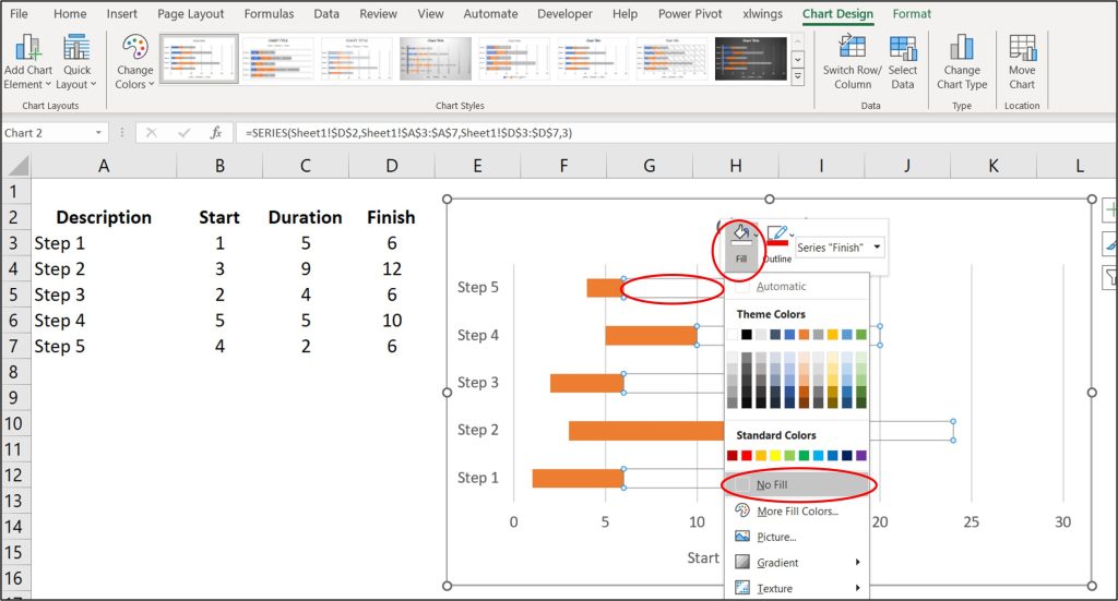
You can then remove unwanted information in your chart such as the Key and the Chart Title by selecting them and then pressing ‘Delete’ (on the keyboard).
And there you have it – you’ve created your basic Gantt chart in Excel!
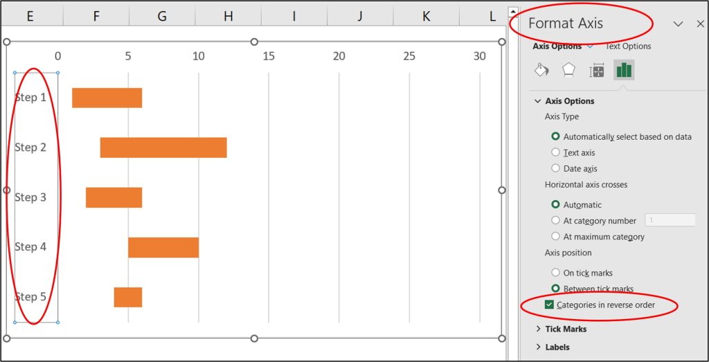
If your data is arranged in the incorrect order (Excel is likely to order your activities in reverse), all you need to do to lay them out chronologically (with Step 1 first) is select your vertical axis, right click and select ‘Format Axis’ from the menu.
A new panel will appear on the right-hand side of your screen. Under ‘Axis Position’ tick the box for ‘Categories in reverse order’ and this will flip the order of your tasks.
If you find that your horizontal axis shows a range much longer than any of your durations, you can shorten this by once again selecting the axis, right-clicking and then choosing ‘Format Axis’.
In the side panel, under ‘Bounds’ reduce your ‘Maximum’ and this will then update your chart to make your durations clearer to identify. You can also change the increments in which your horizontal axis displays your periods by adjusting the ‘Major’ and ‘Minor’ options under ‘Units’.
BONUS TIP: Excel also has some Gantt chart templates ready-made for you. If you go to ‘File’ > ‘New’ and search for ‘Gantt’ you will find a selection of Gantt chart templates (My personal favourite is the Gantt Chart Project Planner) ready to input your data.
One of Excel’s strengths is its ability to update dynamically. If details for the project you’re managing change, it’s easy to update your Gantt charts.
Simply update the data table you created at the beginning of this process, and your Gantt chart will adjust accordingly. This dynamic nature ensures your project management tool is always up-to-date, reflecting the real progress of your project.
Creating Gantt charts in Microsoft Excel might seem complex initially, but with these simple steps, it becomes a breeze.
Excel’s flexibility allows you to customise your Gantt chart to suit your project’s specific needs, providing a clear roadmap for successful project execution.
So, whether you’re managing a team, planning an event, or overseeing a complex project, if you’re not already, start harnessing the power of Gantt charts in Excel – I promise you won’t regret it!

